⭐️ New: Colour indicators on tabs for faster workflows.
Power up your group workflows by enabling color indicators in tabs for easier navigation.
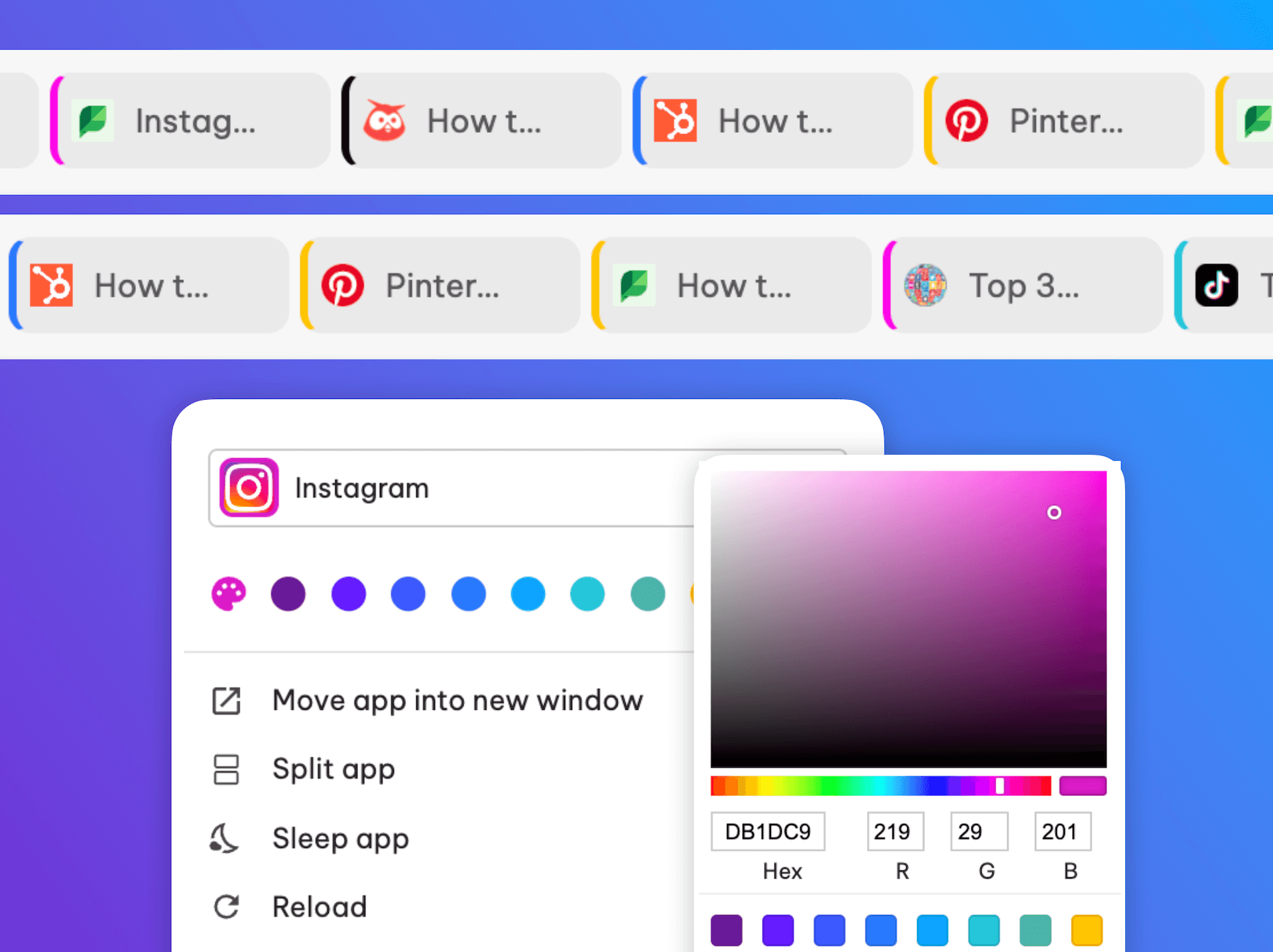
When building workflows in Wavebox, tabs always belong to either an app or a group, depending on where it was opened—this helps to keep things organized and correctly signed in. 🧹
But if you have your group tab strip set to display tabs for 'all apps in a group' then things can start to get a little untidy.......and here at Wavebox, we don't do untidy. Oh no.
So new in this week's release is the option to enable a color indicator on tabs so you can easily spot which parent app they belong to. Handy!
Here's how it works:
- In the video example, this Social Media Group is set to display tabs just for the app in focus, e.g., Instagram and Pinterest both have 2 tabs each.
- You can change this setting so that ALL tabs (from all apps) in the group are shown. Just, right-click on the tab strip and select 'Show tabs in the group.'
- To be able to tell which tabs belong to which group, go to: 'Settings > Tabs > Show parent group/app color' and toggle ON to enable the app colors.
- Also, note that the tab tooltip (hover menu) shows the parent app/group at the bottom.
- To change a group/app border color—not shown in the video—right-click on the icon and select a color from the palette, or right-click and open Settings > App Settings to make the changes there.
With a completely unique navigation system, Wavebox is the only browser to solve the too many tabs problem. Using tabs within tidy group/app workflows, you'll stay organized and more productive. Happy days!
New to Wavebox? If you use a browser to run your business, you can save 2 days per week by switching to Wavebox for work. https://wavebox.io/download.

