🎉 Now Live! Wavebox Reboot 2024.
Bright and colorful update to Wavebox!
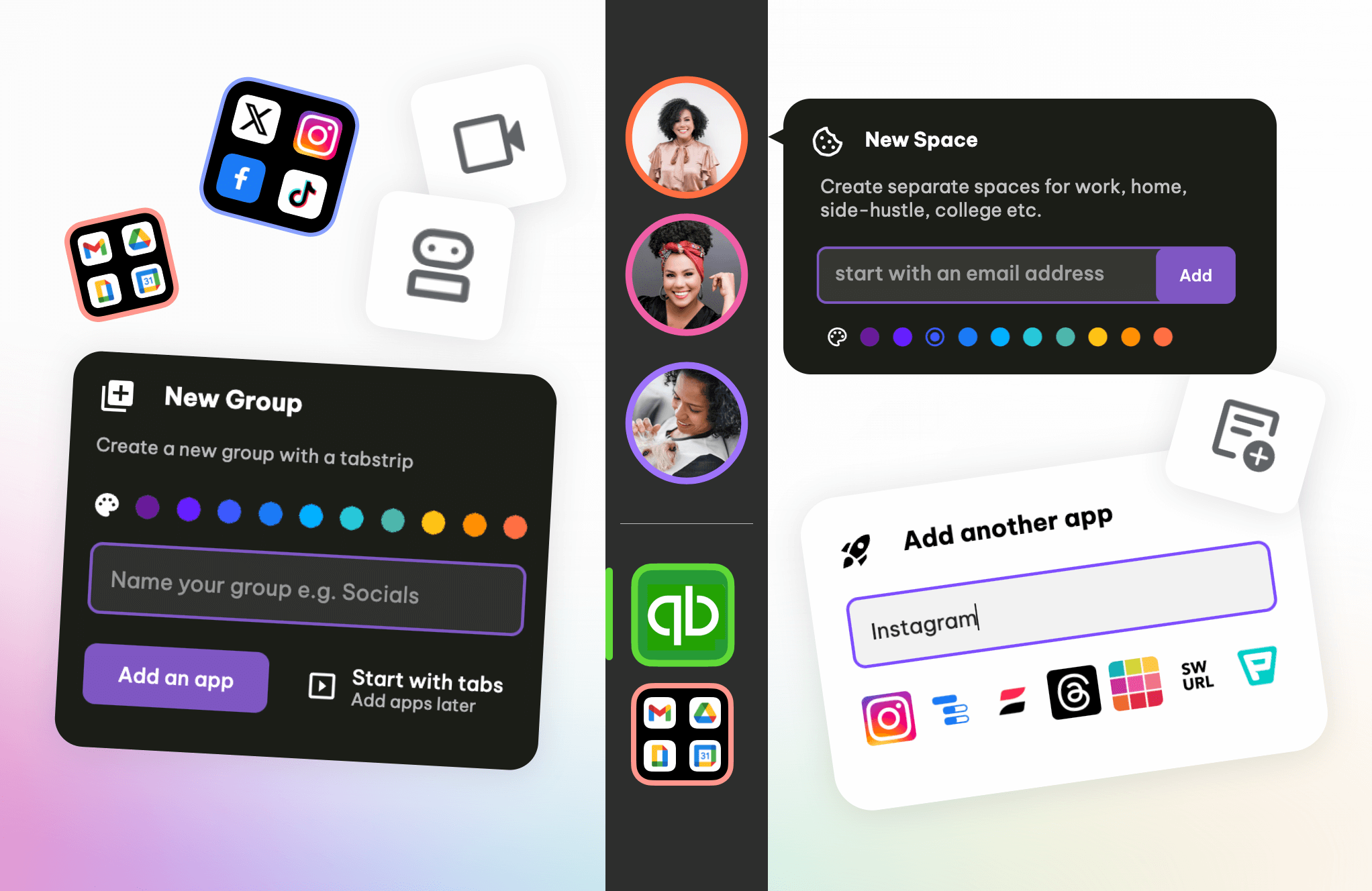
We're super excited today to announce the release of a fabulous new look, Wavebox, for 2024. Our aims with this launch are:
🍎 Easier for new users to get started
✨ UI/UX improvements for clarity and speed
🚀 Under-the-hood fixes for better performance
⭐️ Important Name Changes
- Cookie Containers are now Spaces
- Workspaces are now Dashboards.
Note: The blog and knowledge base are being updated regarding these changes. Our new website will go live within the next day or so.
🍪 Webdock Spaces Layout
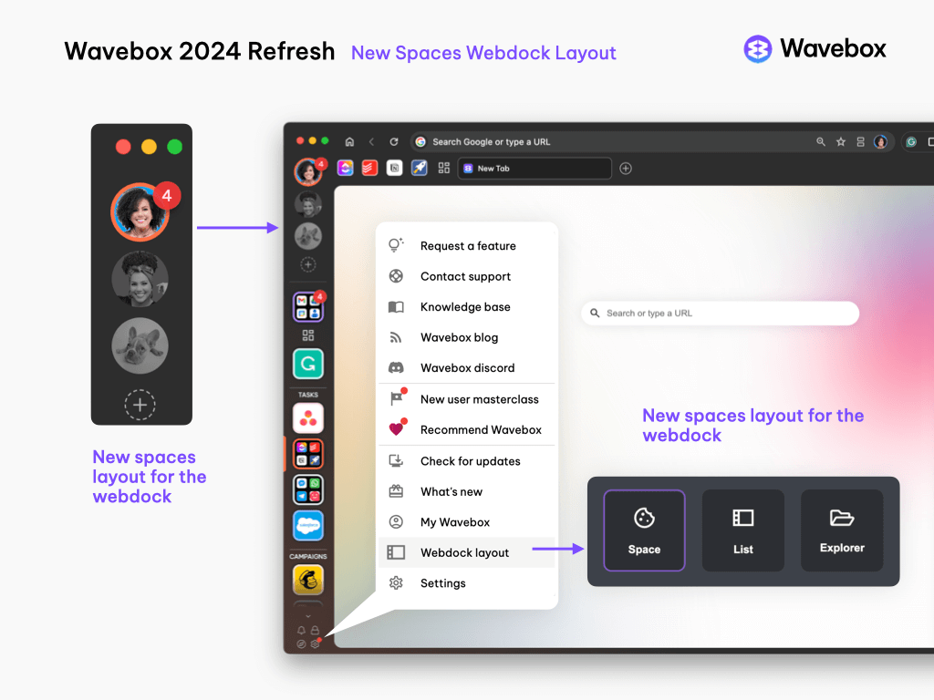
- In addition to the existing List and Explorer webdock layouts, we have added a third called Spaces, which is now the default layout for all new users.
- During Wavebox install, new users are encouraged to create 3 spaces, enter an email for each, and add 4 apps.
- When Wavebox launches, users can switch between spaces using the circle avatars at the top left. The groups in each Space are shown below the Space divider.
- To create a new Space, click on the + icon under the Spaces avatars in the top left. Users should add a webmail account to each Space to aid sticky sign-in, but it's not essential.
- You can hover over a spaces icon to rename it and add a description.
- The Spaces webdock can be viewed in single and double columns. Right-click on a Spaces avatar to make your selection.
Who Should Use Spaces Layout?
- Users with straightforward setups e.g. Home, work, project, side hustle.
- Users, such as VAs and agencies will probably find the existing List view easier.
- You can switch between Spaces, List, and Explorer layouts by hovering over the Settings cog at the bottom left, selecting Webdock Layout, and choosing an option from the picker.
- IMPORTANT: Spaces layout does not support groups/apps with mixed spaces (containers). Use the List layout if you have a more complex setup, e.g., Virtual Assistants and Agencies; see the box below...
USE A NEW PROFILE TO TRY SPACES WEBDOCK.
If your groups contain apps/tabs from different spaces (containers), switching to the new space's layout may reorganize everything and disrupt your workflow.
⚠️ There is no undo button (but you will get a pop-up warning).
Recommended: If you have a complex setup and want to try Spaces webdock, first create a template of your current profile, and use that in a new profile to test it out. If it's not for you, then you can return to your original profile.
Suggestion: Complex VA setups, with more than 4-6 spaces (containers) should stay using the List layout.
🧩 Changes to Dashboards (Workspaces)
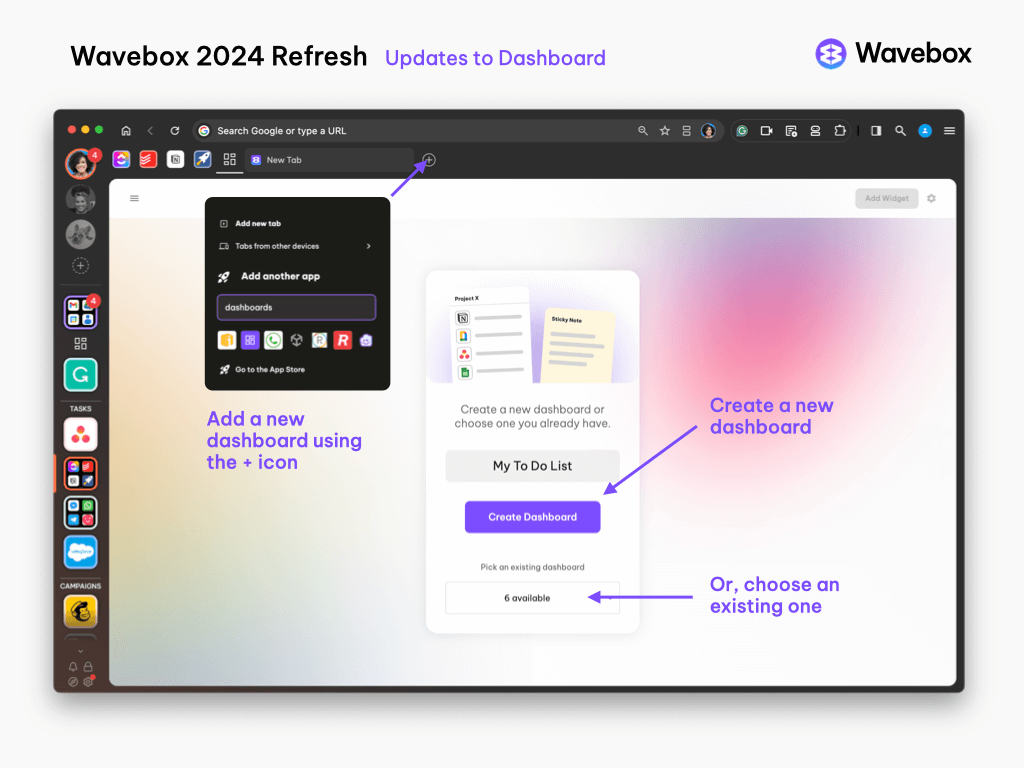
All Users
- New colors and backgrounds
- Updates to the widget library layout
- Updates to the overall Dashboard/widget UI
- Launch a dashboard anywhere from the Burger Menu top-right.
New Users
- New users need to create their first Dashboard as part of the Masterclass, or by adding one via the App Store.
- When adding a Dashboard to a group, users can choose an existing one—the same Dashboard can be added to multiple groups—or create a new one.
- New users do not have the Dashboard burger menu (three lines) top-left, and can only see one Dashboard at a time. (This menu is added if a user upgrades to Teams, or if they turn on advanced Dashboard management)
- New users can use a Dashboard as their new tab by going to Settings > Appearance > New Tab Page > Dashboard New Tab.
🗂️ New Tab Page
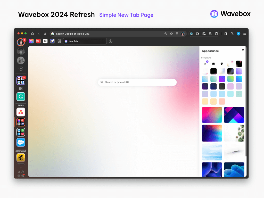
- The default new tab page for new users has a simpler design (see above). Existing users can enable this simpler design by going to any dashboard, clicking on the Settings Cog (top-right), and turning off Advanced Mode.
🚀 Adding Groups and Apps
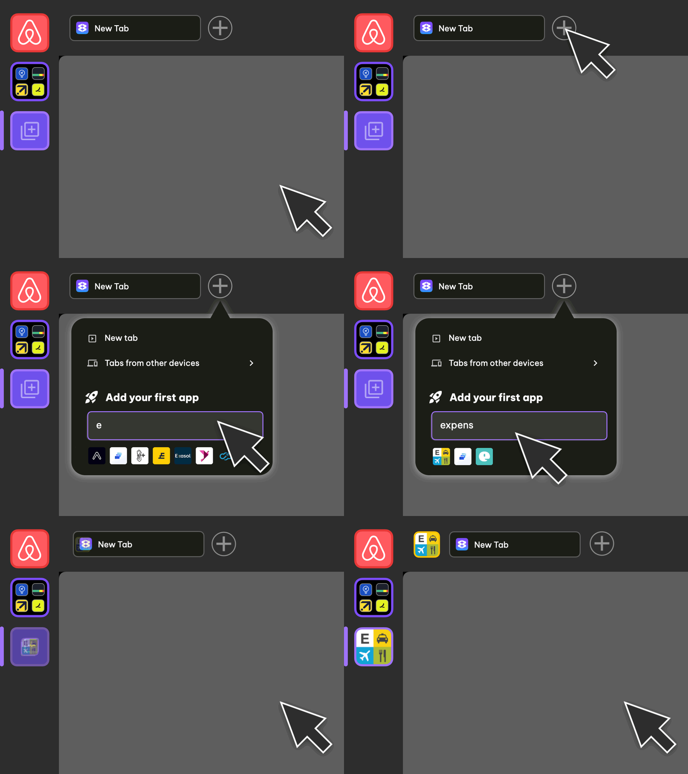
- It's now easier to create new Groups and add Apps.
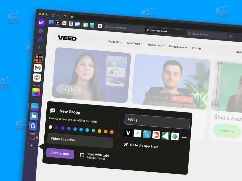
- Groups: Click on the + icon at the bottom of the webdock to bring up the new Group pop-up. You can create a group straight from this pop-up.
- Clicking on Add an App, extends the pop-up so you can search for an app in the store in situ.
- If you can't find an app or want to paste in a URL, there's also a link for you to launch the Store.
- Apps: Hover over the + icon in the group tab strip to bring up the new Apps pop-up, which has the same UI as the Group pop-up.
- 🍪 Note: Existing users - if you need to choose a different space (container) for the new group or app, click on the 'Go to the App Store' link and use the wizard.
⚙️ Settings Advanced Mode
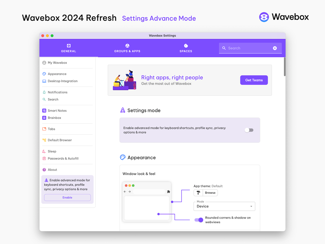
- The main Settings pop-up has a new look and feel.
- New users now see a simplified version of Settings, and there is an Advanced Mode toggle at the top to enable all other settings.
📚 New Installer & Onboarding
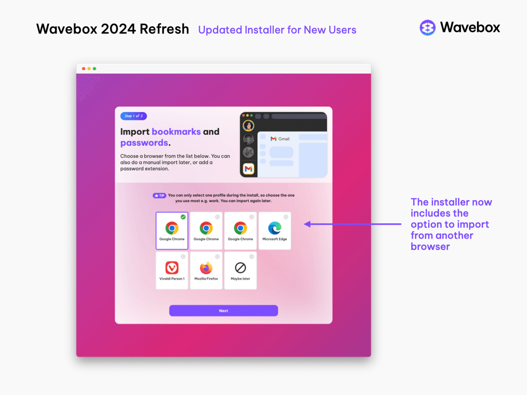
- There is a new install wizard for new users.
- The new installer has the option to import Bookmarks and Passwords from another browser, including Chrome, Edge, Firefox, or Vivaldi.
- There's a new pop-up tour when you first launch, and the Masterclass has also been updated—users can now go back to review previous classes.
✨ General updates
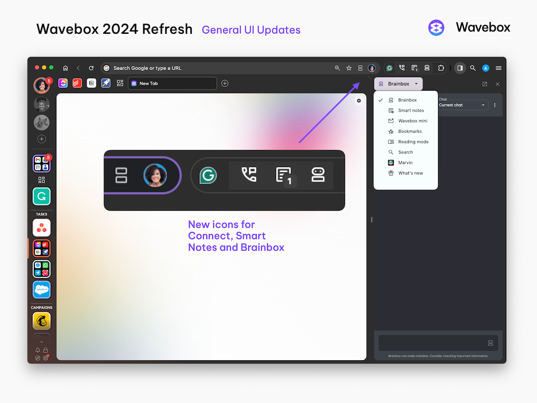
- Webdock group icons have a new look, and unread badges have subtle animations.
- New grid layout for spaces icons. To turn this on, search Settings for 'grid view for groups' and toggle on.
- Group, App & Tab Tooltips (hover menus) have new styling.
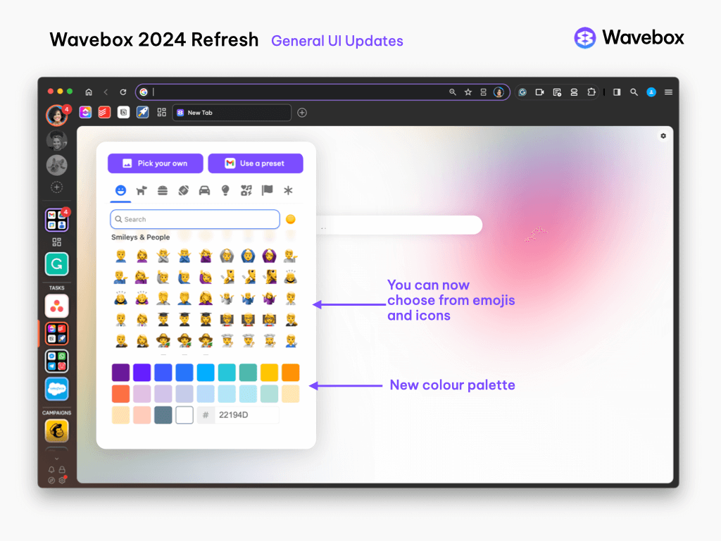
- The icon designer has been updated to include both emojis and icons, so you have plenty of options to make Wavebox your own.
- There are new default color palettes for all color pickers.
- We've added an option to use the light or dark theme regardless of your operating system theme.
- The web search in Global search and New Tab search now uses the default search engine.
- You can now customize the styling of sleeping Groups & Apps. Go to Settings > Groups & Apps > Show Sleeping Apps as Grey. Click on the color palette icon to select custom opacity and greyscale values for the icon.
- We've added some additional keyboard shortcuts, including one to duplicate the current tab in the current window.
Today's release also includes an update to Chromium 125.0.6422.113, plus fixes. Click here for the Change Log.
We hope you enjoy this update, and look forward to getting your feedback.
Join us on our new Discord channel to share feedback and ideas, or chat with us on LinkedIn. We also have a new Feedback Hub where you can submit and vote on new features.

