A 55% Performance Improvement Upgrading Material-UI from v4 to v5
We share some of our experiences in upgrading from version 4 including the 55% performance boost we've seen along the way!

This post comes from our engineering team and details how upgrading our core UI library resulted in some awesome performance improvements! 🚀
A big part of our browser Wavebox, is the user interface and for some of this we utilize React & Material-UI. We've been a heavy user of Material-UI since 2016 and started out using version 0.14.2. Since then we've seen some big changes to the library and a few big migrations. Material-UI 5 recently launched and we wanted to share some of our experiences in upgrading from version 4.
From figuring out what needed to be done, to actually doing it across our entire codebase took us about 3 days, but in doing so we were able to grab a 55% performance improvement. Here's how we did it...
📘 Start with the Migration Guide
Migrating from v4 to v5, you're going to be spending some time here, but the guide covers all the basics and more. There's something to be said for just diving and ignoring the instructions and our takeaway from the migration guide was "update and run codemodes". So we did...
npm install @mui/material @mui/styles @mui/lab @mui/icons-material @emotion/react @emotion/styled
npm uninstall @material-ui/core @material-ui/icons @material-ui/lab
npx @mui/codemod v5.0.0/preset-safe .
...this gives us a starting point. All be it a non-compiling starting point, but still a starting point.
🕶️ Styling
This was the biggest chunk of work for us. We've gone through a styling change before with Material-UI when they moved from inline styles to JSS, but this time Material-UI 5 moves away from JSS as the default styling solution to emotion. We've been relying heavily on JSS for the majority of our components, so lots of them looked something like this...
const styles = (theme) => ({
  root: {
    padding: 8,
    overflow: 'hidden'
  },
  item: {
    margin: 12,
    display: 'inline-block',
    backgroundColor: theme.palette.primary.main
  }
})

@withStyles(styles, { withTheme: true })
class MyComponent extends React.PureComponent {
  render () {
    const { className, classes, theme, ...passProps } = this.props

    return (
      <div className={clsx(className, classes.root)} {...passProps}>
        <div className={classes.item}>1</div>
        <div className={classes.item}>2</div>
        <div className={classes.item}>3</div>
      </div>
    )
  }
}
We had a few options readily available to us in migrating. Either using the styled component api, or using the system. So lets convert this simple component to both to see what it looks like.
Option 1: Using Styled Components
Styled components wrap another component with a set of styles, and from there you just add the component to your react tree. At first glance it looked comfortably familiar, however this would require a fair amount of rework to migrate the existing components.
const Root = styled('div')(
  ({ theme }) => `
  padding: 8px;
  overflow: hidden;
`);
const Item = styled('div')(
  ({ theme }) => `
  margin: 12px;
  display: inline-block;
  background-color: ${theme.palette.primary.main};
`);
class MyComponent extends React.PureComponent {
  render () {
    const { classes, theme, ...passProps } = this.props

    return (
      <Root {...passProps}>
        <Item>1</Item>
        <Item>2</Item>
        <Item>3</Item>
      </Root>
    )
  }
}
Option 2: Using the System
The system lets you define your styles inline alongside the element as a prop. This almost feels like going back to the old inline-styles of React 0.14, but behind the scenes a whole load of clever bits happen, these styles get placed in a stylesheet so they can be re-used. There is a tradeoff using this approach and that is performance. According to Material-ui's own benchmark rendering 1000 Box components takes 370ms vs just 160ms for styled components.
const Item = function (props) {
  return (
    <Box
      sx={{
        margin: 12,
        display: 'inline-block',
        backgroundColor: 'palette.primary.main'
      }}
      {...props} />
  )
}

class MyComponent extends React.PureComponent {
  render () {
    const { classes, theme, ...passProps } = this.props

    return (
      <Box
        sx={{
          padding: 8,
          overflow: 'hidden'
        }}
        {...passProps}
      >
        <Item>1</Item>
        <Item>2</Item>
        <Item>3</Item>
      </Box>
    )
  }
}
🤔 Option 3: Erm...
Okay, I'll be honest here, we stopped for a minute to consider our options. Performance is a big thing for us and more than doubling the render time isn't something that's overly appealing. We've been using Material-ui long enough to remember the performance boost in moving from inline-styles to JSS and all those little performance boosts really make a difference.
We were also looking for some kind of shortcut, we've got a lot of components and having to go through each one by hand takes time. We couldn't see any easy method to automate (either at runtime, or during development) the migration.
We then looked at re-implementing "withStyles" so that we could consume our current styles and output something that we can use with MUI5, but this just felt like a band-aid that we'd be picking off at a later date.
So we went back to the drawing board and looked at other options. After a bit of playing around we settled on something completely different. Something that could potentially give us a free performance boost and some semi-automated migration.
🤩 Introducing CSS! Yeah, okay, a little anticlimactic. Our thinking was that by dropping the whole CSS in JS approach we'd drop a bunch of processing work that needs to be done in JavaScript and grab some free CPU cycles along the way. We're already using LESS for a few styles around the app, so everything is already setup in our build scripts. This didn't seem like all that much of a jump.
With a bit of (cool 😎) scripting, we thought we could semi-automate most of the migration. Our style definitions normally start with "const styles =" so it wouldn't be too hard to pull those out, convert them from JSS into CSS and write them into a file. Here's what our new component looks like...
MyComponent.module.less
.root {
  padding: 8px;
  overflow: hidden;
}
.item {
  margin: 12px;
  display: inline-block;
  background-color: "__TODO__"
}
MyComponent.js
import classes from './MyComponent.module.less'
class MyComponent extends React.PureComponent {
  render () {
    const { className, theme, ...passProps } = this.props

    return (
      <div className={clsx(className, classes.root)} {...passProps}>
        <div className={classes.item}>1</div>
        <div className={classes.item}>2</div>
        <div className={classes.item}>3</div>
      </div>
    )
  }
}
As you can see, not too much of a jump. The only bit missing is that pesky theme property for the background color, we came up with a couple of options here...
- Just define the property twice, once in JavaScript and other time using LESS
- Use CSS variables and write this out to the document from JavaScript
...we decided we could use both. We split our theme properties into two categories, those that don't change ("palette.primary.main" is one of those, it's always blue) and those that do change ("palette.background.paper" depends on the users preference for dark or light mode). Using both approaches gives us the best of both worlds. By extending our theme provider, we could push out what we need to CSS pretty quickly...
class ThemeProvider extends React.PureComponent {
  constructor (props) {
    super(props)

    this.state = {
      theme: createTheme({ ... })
    }
    this.stylesheet = document.createElement('style')
    document.head.prepend(this.stylesheet)
  }
  render () {
    const { theme } = this.state

    document.body.className = `theme-${theme.palette.mode}`
    this.stylesheet.innerHTML = `
      :root {
        --theme-primary-main: ${theme.palette.primary.main};
      }
    `

    return (
      <StyledEngineProvider injectFirst>
        <ThemeProvider theme={theme}>
          {children}
        </ThemeProvider>
      </StyledEngineProvider>
    )
  }
}
LESS variables
As mentioned above, we tend to use LESS variables for colors that don't change, but if you need to customize them depending on the theme you can read the class from the document body. It's a little bit more code, but everything is setup at compile time.
@theme-primary-main-light: #0277BD;
@theme-primary-main-dark: #4FC3F7;

.item {
  :global(body.theme-light) {
    background-color: @theme-primary-main-light;
  }
  :global(body.theme-dark) {
    background-color: @theme-primary-main-dark;
  }
}
CSS Variables
If the color is completely undetermined or it's something that we know will change, then we can use CSS variables. Once the theme provider is up and running the colors are set and component looks as it should.
.item {
  background-color: var(--theme-primary-main);
}
🚀🚀🚀 Performance. Yes!
As we suspected, we managed to pick up some free performance, but what we weren't expecting is how much. We used our settings screen as a benchmark, taking 3 sets of measurements using the performance tab in Chromium.
Material-UI 4
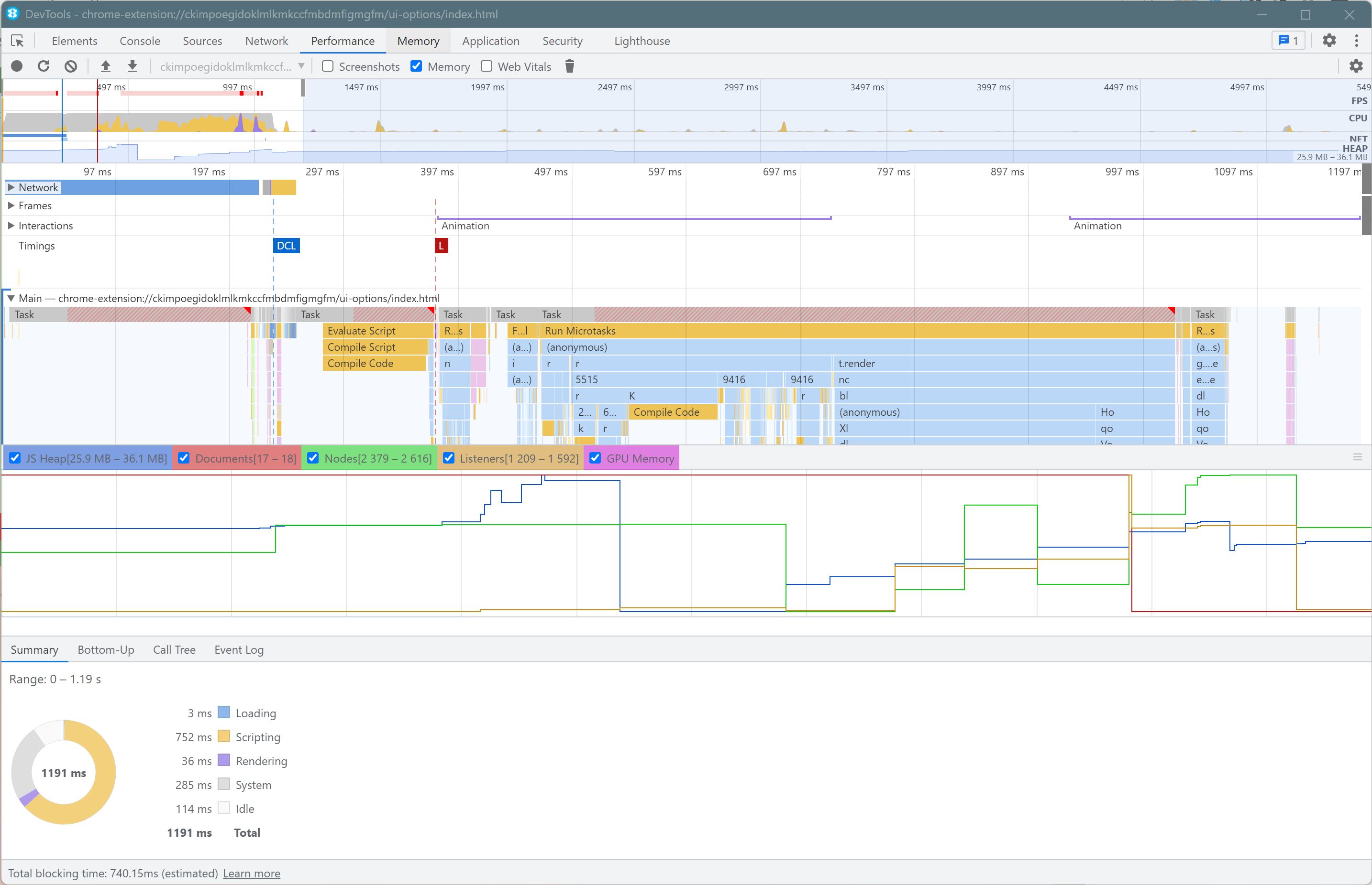
- CPU Time: 1191ms, 1200ms, 1163ms (Average 1185ms)
- Blocking time: 740ms, 859ms, 792ms (Average 797ms)
- Peak JS Heap: 36.1mb, 35.9mb, 36.2mb (Average 36mb)
Material-UI 5
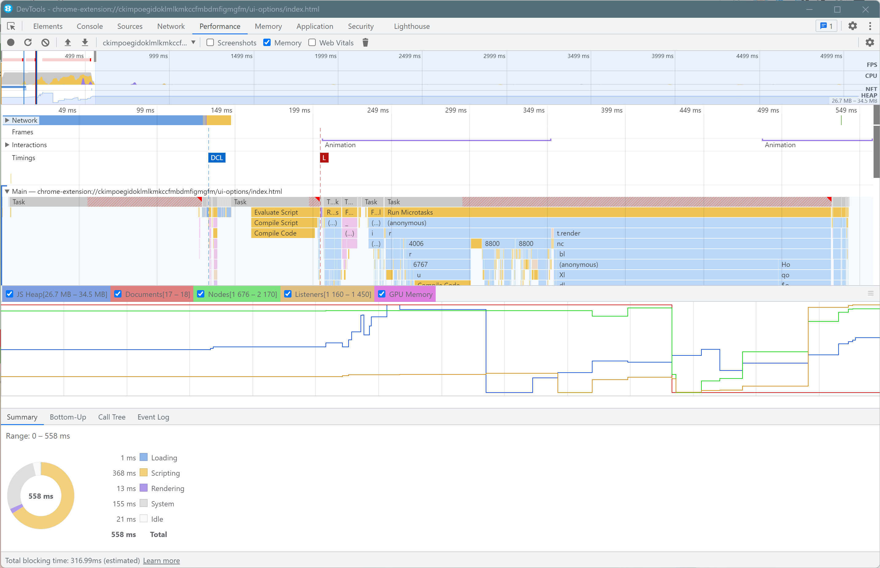
- CPU Time: 558ms, 758ms, 559ms (625ms)
- Blocking time: 316ms, 447ms, 314ms (359ms)
- Peak JS Heap: 34.5mb, 35.2mb, 34.6mb (34.7mb)
Yep, that's a whopping 55% reduction in blocking time. Down from 797ms to 359ms. That saving deserves some cake to celebrate 🎂.
Alongside that we saw an equally impressive 48% reduction in CPU time and a slight drop in memory (1.3mb). All these big (and small) improvements help keep Wavebox running fast and smoothly.
We're working to roll this update out to our beta channel over the next week or so in Wavebox version 10.95.
20/10/21 - StyledComponents referenced the legacy version, updated to use the latest
Lead Photo by Hello I'm Nik on Unsplash